
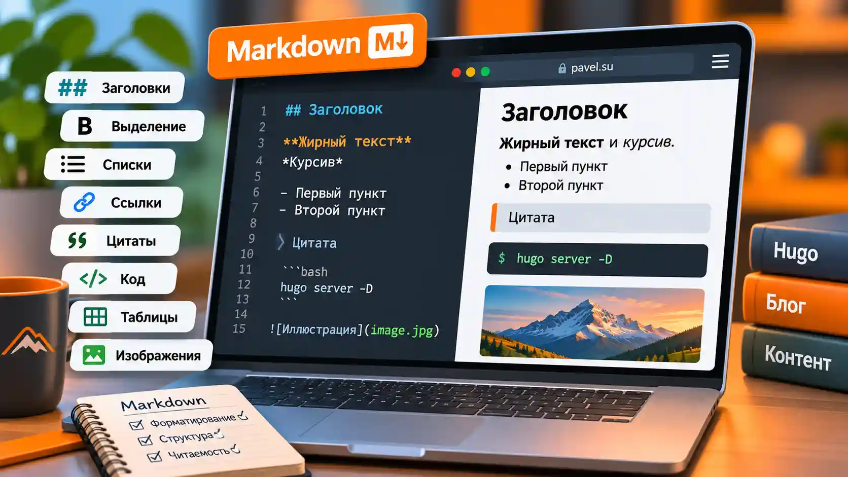
A guide to Markdown formatting and shortcodes in Hugo Pocket, with live examples.
Description
The description field in a page’s Markdown front matter sets the short description shown at the top of the page and beneath the post title in article lists on the homepage, category pages, tag pages, and elsewhere.
+++
...
description = "Markdown formatting elements with rendered examples for the Hugo Pocket theme."
...
+++
Headings
# Level 1 heading
## Level 2 heading
### Level 3 heading
…
(You can see rendered examples throughout this article.)
Text Formatting
Basic text formatting: **bold** bold, *italic* italic, ***bold italic*** bold italic, `inline code` inline code, ~~strikethrough~~ strikethrough, and <u>underlined text</u> underlined text.
A single backtick on each side creates inline code. Inline code has no copy button.
Three backticks on their own lines create a code block with a copy button.
To show a code fence made of three backticks, wrap the example in a fence made of four backticks.
Horizontal Rule
To insert a horizontal rule, put this on its own line:
---
Links
Single Link
[Link to Hugo](https://gohugo.io/) renders as Link to Hugo.
Link Cards
{{< friendlinks >}}
  - title: Hugo
    description: The world's fastest static site generator.
    website: https://gohugo.io
    image: https://gohugo.io/favicon.ico
  - title: Pocket Hugo App
    description: Write posts directly in the Pocket Hugo app.
    website: https://leftn.com
    image: logo-app.webp
  - title: Pocket Hugo Theme
    description: The coolest theme around.
    website: https://theme.leftn.com
    image: pocket-hugo-theme-logo.webp
{{< /friendlinks >}}


Lists
Unordered List
- One item.
- Another item.
- A second item.
- A third item.
- One item.
- Another item.
- A second item.
- A third item.
Ordered List
1. First item.
2. Second item.
3. Third item.
- First item.
- Second item.
- Third item.
Task List
- [x] First task done
- [x] Second task done
- [ ] This task still needs doing
- First task done
- Second task done
- This task still needs doing
Blockquotes, Callouts, and Notes
> A quotation in the article.
>
> It can span multiple lines.
A quotation in the article.
It can span multiple lines.
Use the note shortcode to highlight tips, warnings, or side comments.
{{< note type="info" title="Note heading (gray)" >}}
Put any text you want readers to notice inside the note.
{{< /note >}}
type="info"
type="tip"
type="warn"
Code Blocks
Enclose any text in a pair of three-backtick fences:
```
theme = "pocket-hugo-theme"
defaultContentLanguage = "en"
mainSections = ["posts"]
```
It renders like this:
theme = "pocket-hugo-theme"
defaultContentLanguage = "en"
mainSections = ["posts"]
You can specify a language for syntax highlighting. For HTML, put html after the opening fence:
```html
<html>
	<body>
	<p>Text on an HTML page</p>
	</body>
</html>
```
<html>
	<body>
	<p>Text on an HTML page</p>
	</body>
</html>
To show an example with a three-backtick fence, enclose it in a four-backtick fence. Use a longer outer fence for longer inner fences.
Tables
| Element | What it does |
| --- | --- |
| Headings | Give the text a rhythm |
| Lists | Organize information |
| Blockquotes | Show which words are quoted |
| Images | Illustrate otherwise dry text |
| Element | What it does |
|---|---|
| Headings | Give the text a rhythm |
| Lists | Organize information |
| Blockquotes | Show which words are quoted |
| Images | Illustrate otherwise dry text |
Wide tables scroll horizontally when they run out of room.
| Heading | Heading | Heading | Heading | Heading | Heading | Heading | Heading | Heading | Heading | Heading | Heading | Heading |
|---|---|---|---|---|---|---|---|---|---|---|---|---|
| Item | Item | Item | Item | Item | Item | Item | Item | Item | Item | Item | Item | Item |
| Item | Item | Item | Item | Item | Item | Item | Item | Item | Item | Item | Item | Item |
| Item | Item | Item | Item | Item | Item | Item | Item | Item | Item | Item | Item | Item |
| --- | --- | separator row beneath the header is required.
Collapsible Content
The fold shortcode shows a short line of text with an arrow. The extra content stays hidden until the reader expands it.
{{< fold "A short line of text with an arrow" >}}
This extra text appears only after you click the arrow. It can include formatting and elements such as `<details>`.
{{< /fold >}}
A short line of text with an arrow
<details>.
Badges
Badges are simple labels for indicating status or marking content.
{{< badge "Stable" >}}
{{< badge text="Optional" type="info" >}}
{{< badge text="Experimental" type="warn" >}}
Stable Optional Experimental — badges can sit on the same line.
Default type — Stable
type="info" — Optional
type="warn" — Experimental
Buttons
Use the button shortcode to add a clickable action within the text.
{{< button href="/" label="Open the homepage" >}}
{{< button href="https://ya.ru" label="Open Yandex" style="ghost" >}}
Images


For an image in the same folder as the article, use the filename. For an image in a subfolder, include the folder name.
To create an image gallery, use a separate gallery implementation.
Video and Audio
Embed local or external audio and video:
{{< video src="/media/demo.mp4" title="Local HTML5 video" >}}A text description of the video.{{< /video >}}
{{< audio src="/media/demo.mp3" title="Audio clip" >}}A text description of the local audio clip.{{< /audio >}}
{{< youtube id="rdwz7QiG0lk" >}}An embedded YouTube video styled to match the theme.{{< /youtube >}}
{{< bilibili bvid="BV1xx411c7mu" >}}The same kind of embed for Bilibili.{{< /bilibili >}}
Timeline
Use the timeline shortcode to show a sequence of events.
{{< timeline >}}
{{< timeline-item date="2026-01" title="Planning" >}}Making plans for a bright future.{{< /timeline-item >}}
{{< timeline-item date="2026-08" title="Construction" >}}Building that bright future.{{< /timeline-item >}}
{{< timeline-item date="2026-02" title="Finishing touches" >}}Making that bright future look good.{{< /timeline-item >}}
{{< /timeline >}}
- Events appear in the order you write them. The dates are labels.
- You can place independent timeline blocks anywhere in the article.
Columns
Use the columns shortcode for side-by-side comparisons and similar layouts. You can add several columns.
{{< columns >}}
{{< column >}}
### Left column heading

- Quick comparisons
- Summaries
- Before and after
{{< /column >}}
{{< column >}}
### Right column heading

- Brief notes
- Lists
- Longer content fits here too
{{< /column >}}
{{< /columns >}}
Left column heading
- Quick comparisons
- Summaries
- Before and after
Right column heading
- Brief notes
- Lists
- Longer content fits here too
Here’s how three columns look. Each column appears as a separate card.
{{< columns >}}
{{< column >}}
### Left column heading

- Quick comparisons
- Summaries
- Before and after
{{< /column >}}
{{< column >}}
### Middle column heading

- Compare left and right
- A middle option
- Pricing plans sometimes use this layout
{{< /column >}}
{{< column >}}
### Right column heading

- Brief notes
- Lists
- Longer content fits here too
{{< /column >}}
{{< /columns >}}
Left column heading
- Quick comparisons
- Summaries
- Before and after
Middle column heading
- Compare left and right
- A middle option
- Pricing plans sometimes use this layout
Right column heading
- Brief notes
- Lists
- Longer content fits here too